LA.MOMA is an app for a modern art museum, that provides access to all the information about museum exhibitions and events in one place, allows one to book tickets, and includes navigation through the museum building once there.
The project was part of the Google UX Design Course with user research and a low-fidelity prototype done in Jun ’22 - Jul’22 and usability research and a high-fidelity prototype in Jan ‘23.
User Research
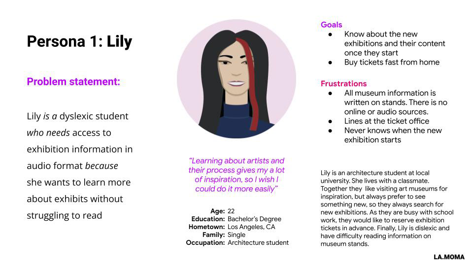
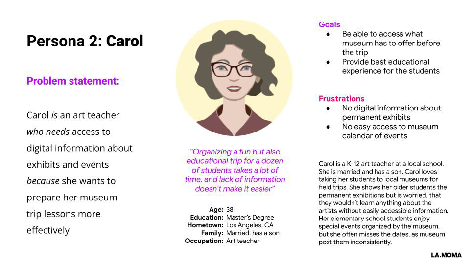
Through creating personas, and user journey maps, empathizing with users, and identifying user pain points I was able to determine which features the app requires and what opportunities there are to improve the museum experience.
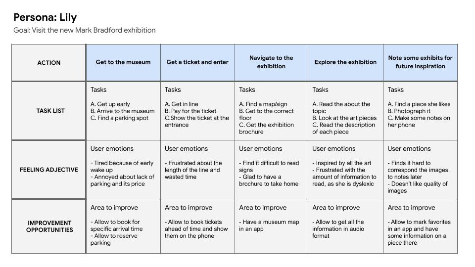
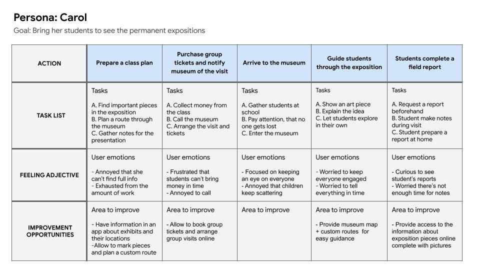
User Journey Maps
Through creating user journey maps I identified specific opportunities where the app could be used and thus made a list of necessary functions in the app. These functions include:
• Map
• Navigation through the museum
• Exhibit information and description
• Calendar
• Ticket booking
• Access to existing tickets
• Navigation through the museum
• Exhibit information and description
• Calendar
• Ticket booking
• Access to existing tickets
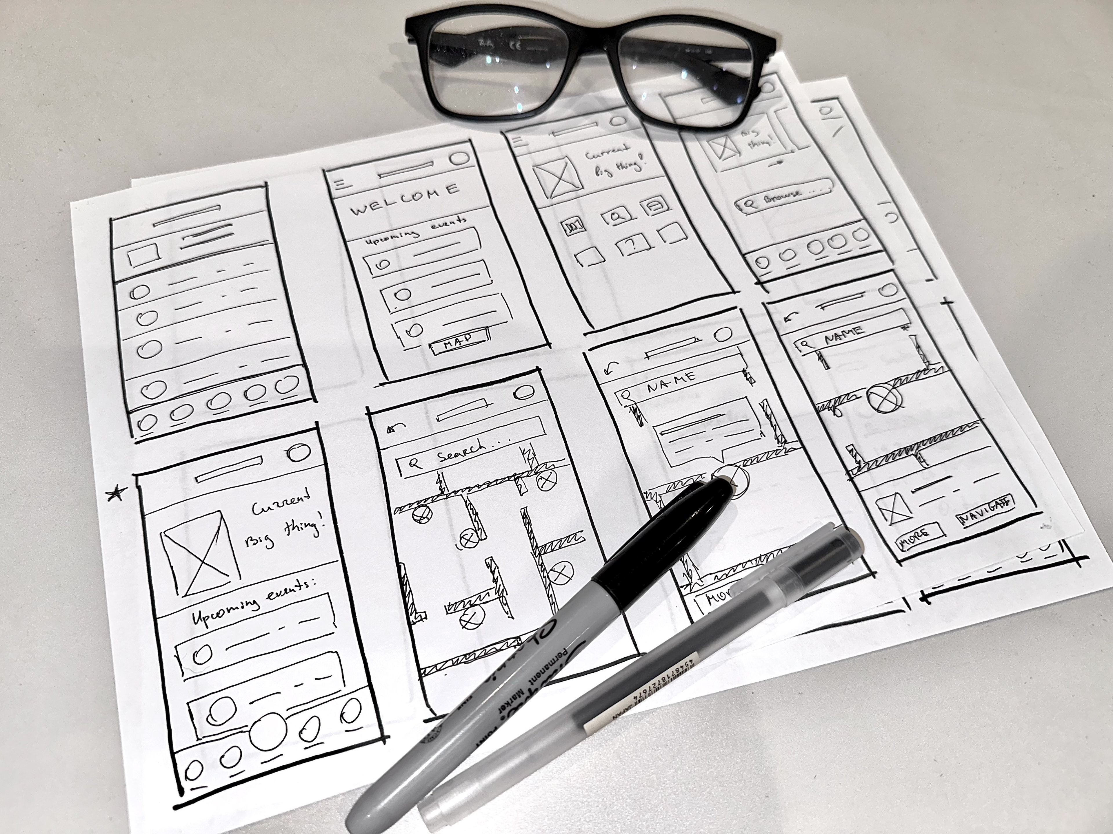
Wireframing and Low-Fidelity Prototype
I iterated through various ideas for wireframes on paper and selected the most successful options to implement in digital wireframes.
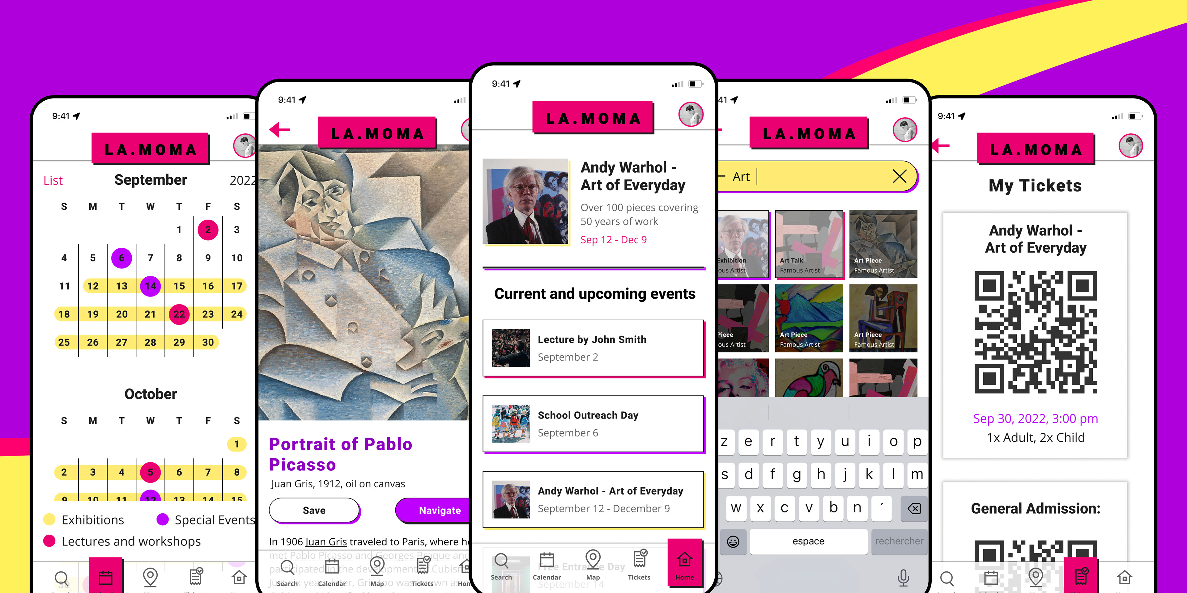
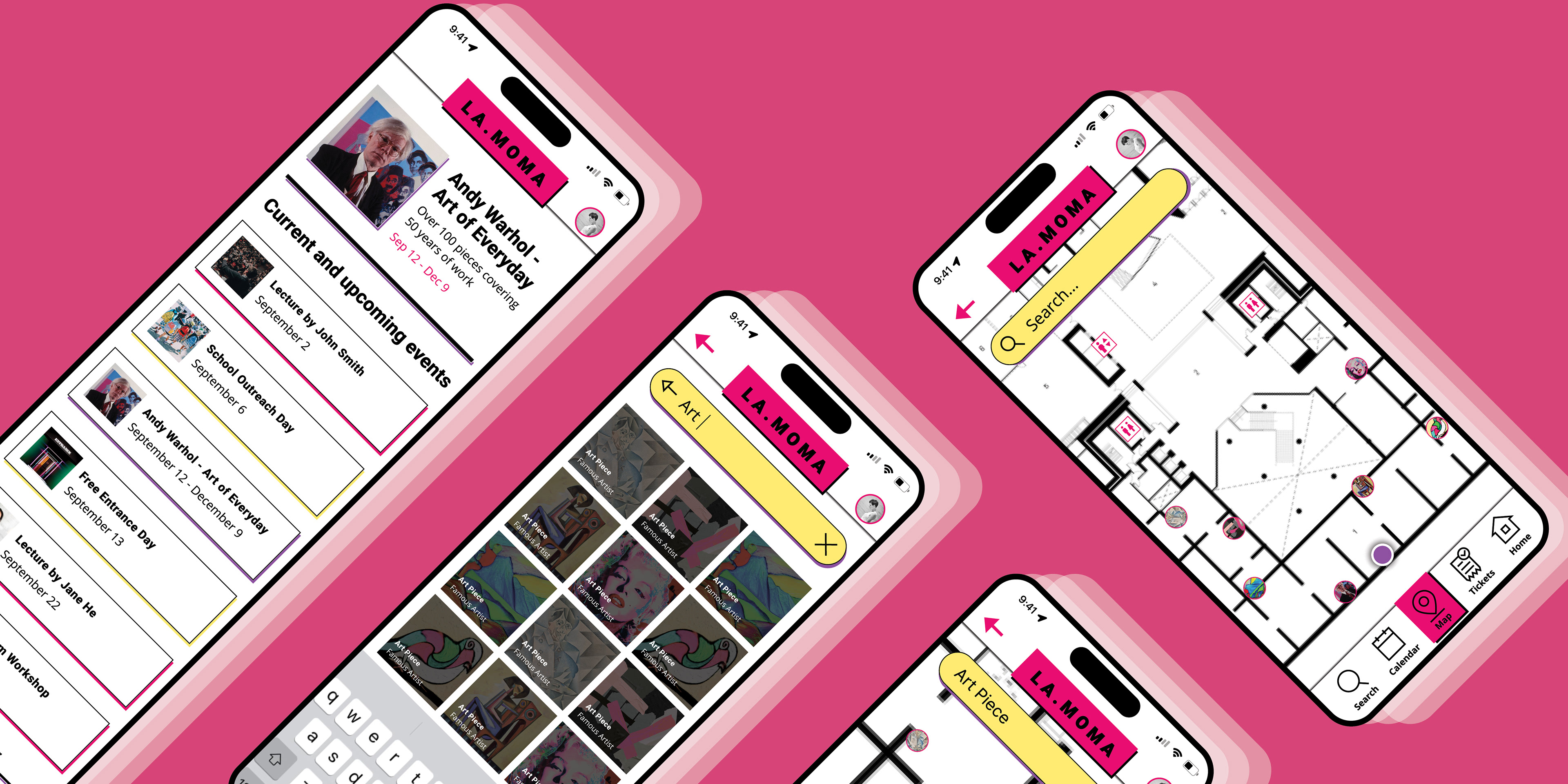
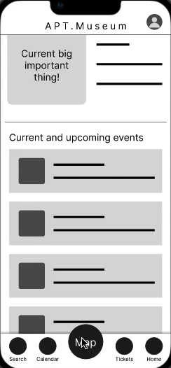
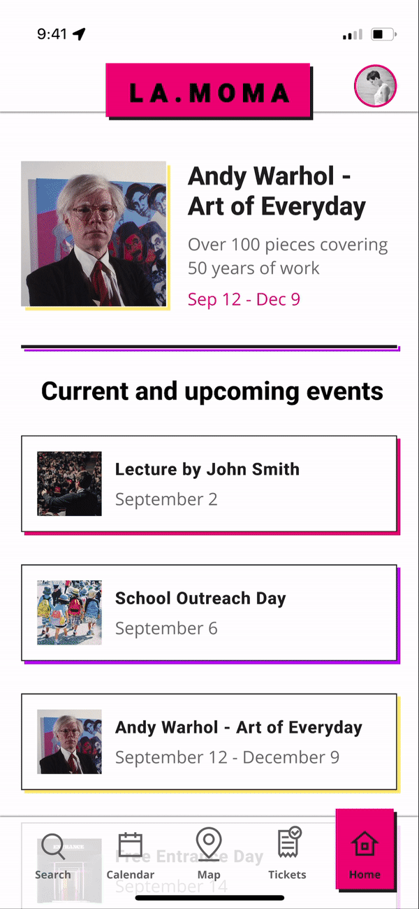
The home screen provides an immediate overview of the app functionality and also provides quick access to the most important events. The map allows one to navigate through the museum and has a familiar interface similar to common navigation apps. This allows user to quickly find their way through the app.
The low-fidelity prototype demonstrates how you can find a desired art piece in the museum and see directions to it on the map feature. It then leads you through the selection of an exhibition from the upcoming list and booking the ticket for it.
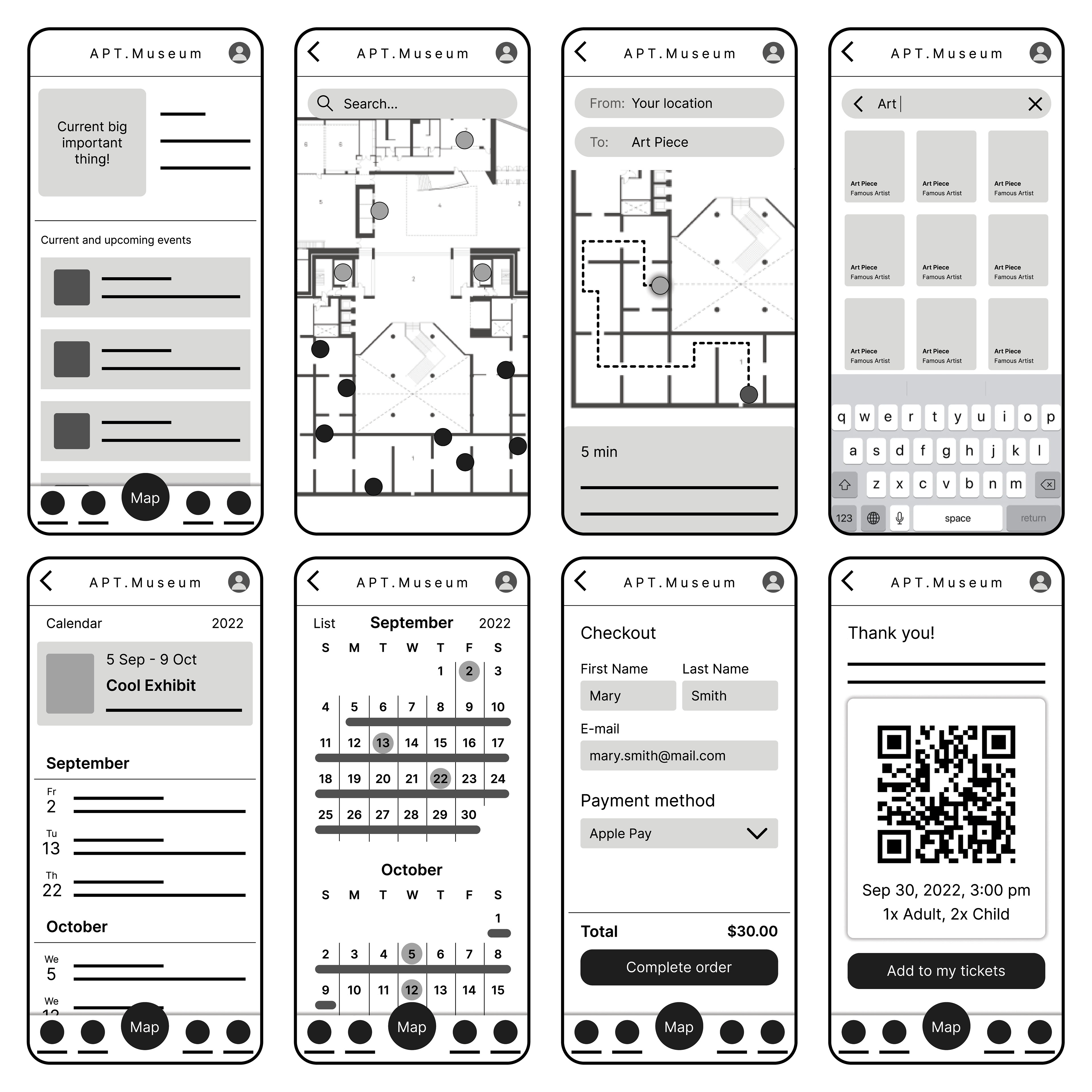
Digital Wireframes
Low-Fidelity Prototype
Usability Research
Unmoderated usability studies were conducted among 5 participants. Users were asked to look at the low-fidelity prototype and accomplish several simple tasks.
The research findings demonstrated the following problems:
• The navigation through the app in some views was not straight-forward
• Users expected the map to be more dynamic
• Users needed better cues to navigate through the calendar view
• A return button needs to be clearly visible
After that, the following elements were adjusted:• Users expected the map to be more dynamic
• Users needed better cues to navigate through the calendar view
• A return button needs to be clearly visible
• Added Navigation Buttons to all screens
• Made map more interactive
• Added legend to the calendar view
• Added a clear return button during checkout
• Made map more interactive
• Added legend to the calendar view
• Added a clear return button during checkout
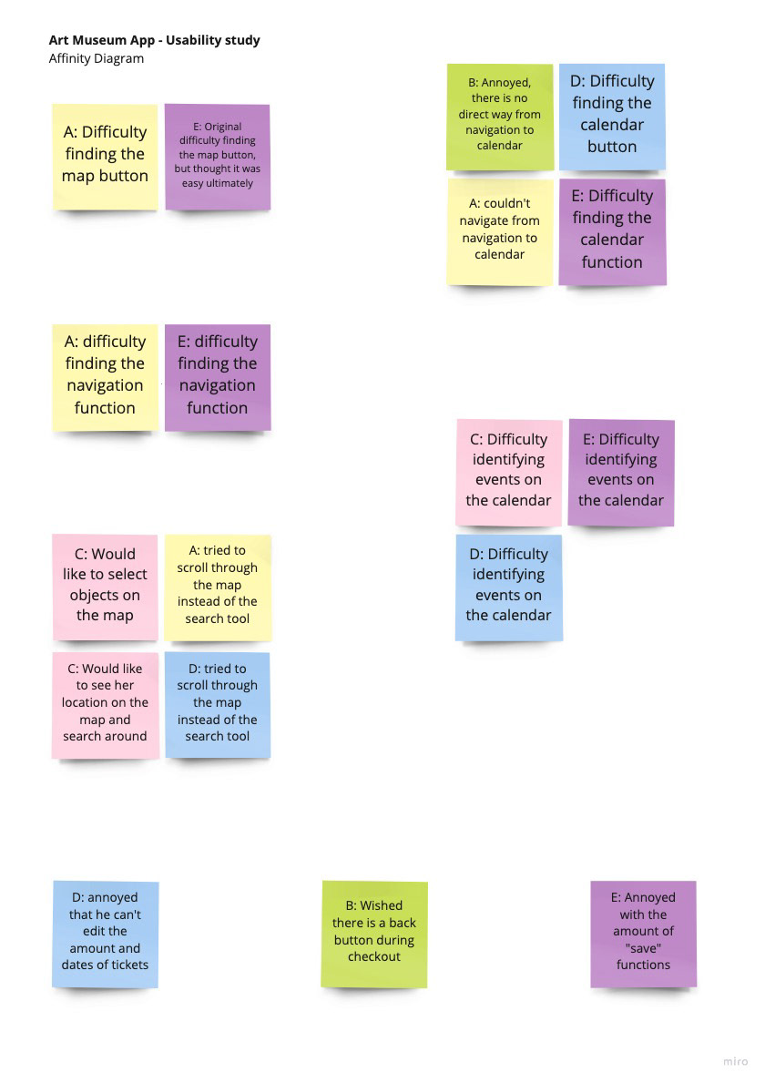
Affinity Diagram
Mockups and High-Fidelity Prototype
To refine the visual design I developed a set of elements to use across the app: menu elements, iconography, typography, and color.
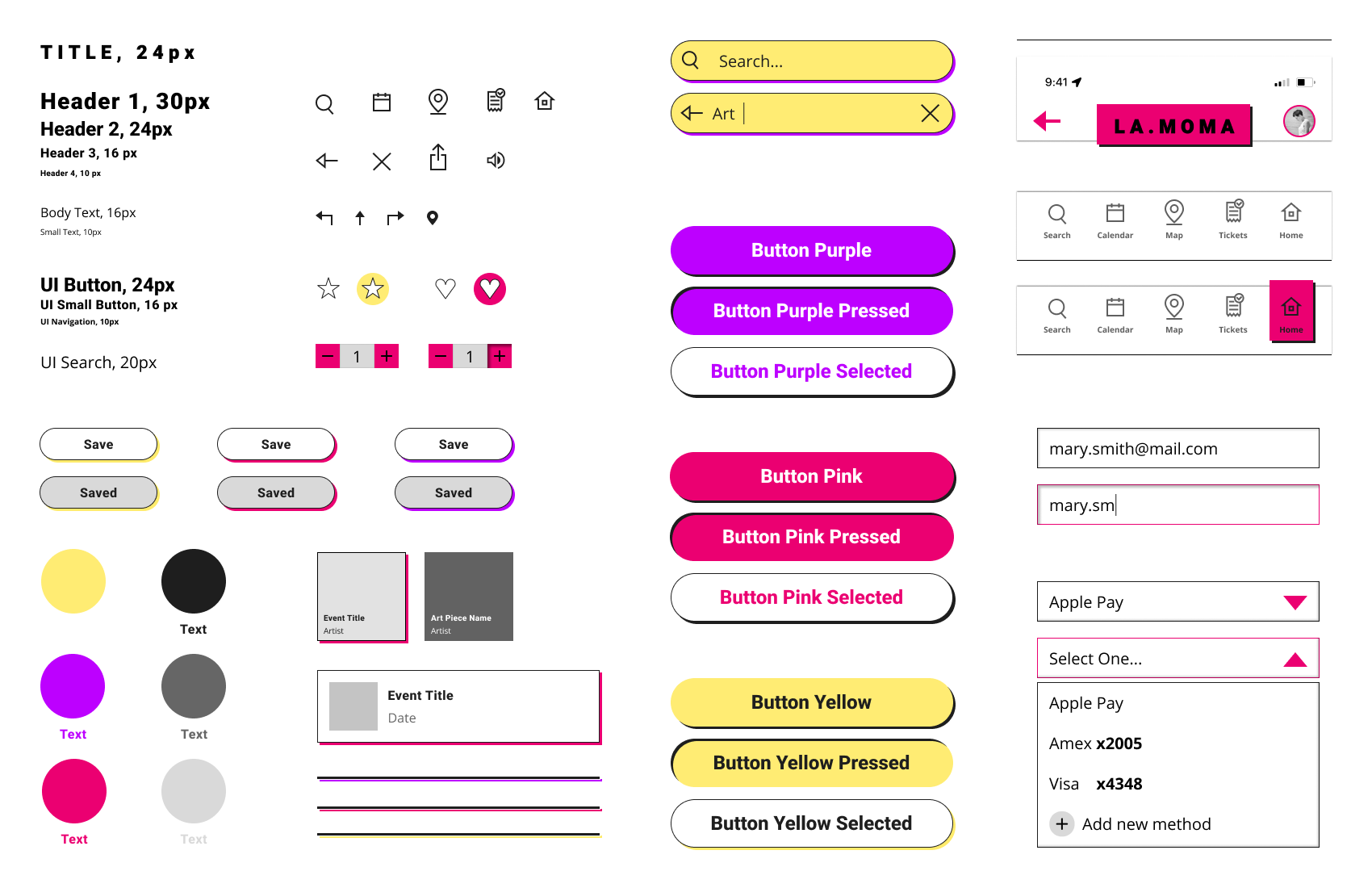
Sticker Sheet
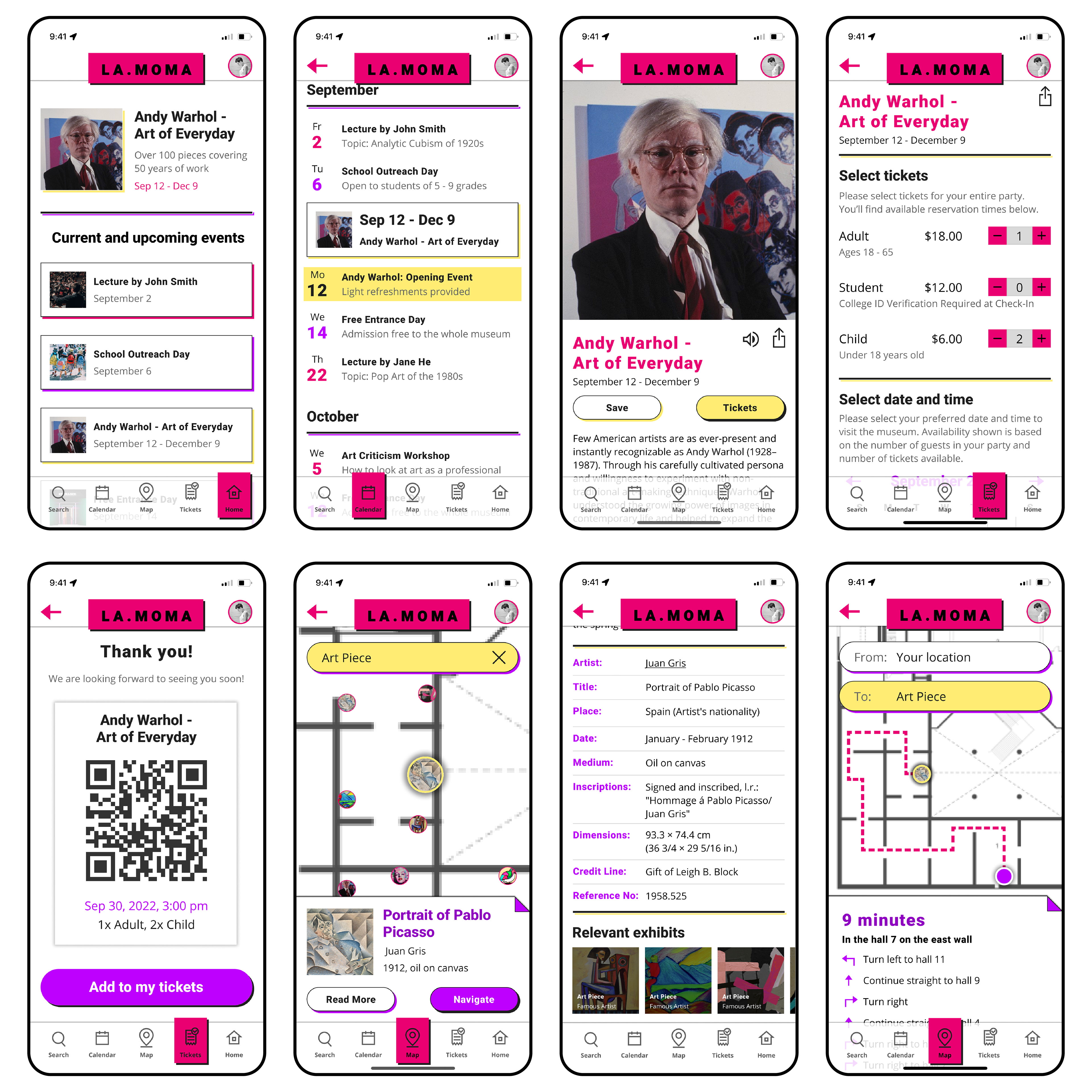
Mockups
High-fidelity prototype
The prototype includes the following accessibility features:
1. Contrast colors, that highlight important elements, and allow for clear navigation. The color contrast satisfies the accessibility requirements
2. There is an option to read out loud long texts about exhibits and events
3. The animation is minimal and does not distract from the app experience